Pure CSS speech bubbles

Speech bubbles are a popular effect but many tutorials rely on presentational HTML or JavaScript. This tutorial contains various forms of speech bubble effect created with CSS 2.1 and enhanced with CSS3. No images, no JavaScript and it can be applied to your existing semantic HTML.

The CSS file used in the demo page is heavily commented so that you can see which lines of code are responsible for each part of the effects.

Demo: Pure CSS speech bubbles

Support: Firefox 3.5+, Safari 4+, Chrome 4+, Opera 10+, IE8+.

Progressive enhancement with pseudo-elements

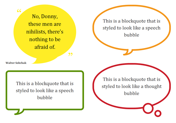
With HTML as simple as <div>Content</div> or <p>Content</p> you can produce speech bubble effects like this:

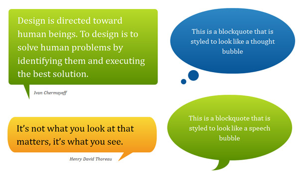
Add a child element, for example, <blockquote><p>Quote</p></blockquote> and you can even produce speech bubble effects like this:

I’d encourage you to adapt the examples to your needs and use any other associated elements available to you in your existing HTML document. The key is to use the :before and/or :after pseudo-elements to produce basic shapes.

By applying CSS3 properties such as border-radius and transform you can produce more complex shapes and orientations. This is how the heart-shape in my CSS typography experiment was created.

Example code

This is an example of how to create a basic speech bubble with a few enhancements. For further examples see the demo page and the heavily commented CSS file that it uses.

/* Bubble with an isoceles triangle
------------------------------------------ */

.triangle-isosceles {
   position:relative;
   padding:15px;
   margin:1em 0 3em;
   color:#000;
   background:#f3961c;

   /* css3 */
   -moz-border-radius:10px;
   -webkit-border-radius:10px;
   border-radius:10px;
   background:-moz-linear-gradient(top, #f9d835, #f3961c);
   background:linear-gradient(top, #f9d835, #f3961c);
}

/* creates triangle */
.triangle-isosceles:after {
   content:"";
   display:block; /* reduce the damage in FF3.0 */
   position:absolute;
   bottom:-15px;
   left:50px;
   width:0;
   border-width:15px 15px 0;
   border-style:solid;
   border-color:#f3961c transparent;
}

A note on progressive enhancement

This approach is one of progressive enhancement. Styles are built up in layers from simple coloured boxes, to boxes with a “speech tick” of some kind, to rounded rectangles or circles with gradient backgrounds. Browsers render the styles that they are capable of rendering.

Browsers (such as IE6 and IE7) that do not adequately support CSS 2.1 or those (such as IE8) without support for the necessary CSS3 properties will not look broken; they will simply not get the full speech bubble effect. However…

A warning about Firefox 3.0

Firefox 3.0 supports the necessary CSS 2.1 pseudo-elements but does not support the positioning of generated content.

Some of the examples are close to what I consider to be unacceptably broken in Firefox 3.0. It is the only browser above 2% market share — currently at ~4% as of March 2010 according to NetApplications — that cannot handle even the basic speech bubble effects.

Before applying this technique, consider the importance of Firefox 3.0 support and the percentage of your visitors currently using this browser. Eventually it will become a rare browser but due to it’s partial CSS 2.1 support you should be aware that there is no graceful fallback for Firefox 3.0 when using this technique.

50 comments

#

Eduardo Vasconcelos says…

Great technique, in quirksmode.org says: Don’t use

I feel that we shouldn’t use the content declaration at all. It adds content to the page, and CSS is meant for adding presentation to the page, and not content. Therefore I feel that you should use JavaScript if you want to dynamically generate content. CSS is the wrong tool for this job.

but in this case, i think is right to use, keeps html clean and easy.
great job!

#

Evan Byrne says…

Just gotta say I was very impressed when I saw the demo! I’m going to attempt to dig though it and hopefully I’ll learn a thing or two in the process! :)

#

Rilwis says…

Awesome! I can’t imagine that CSS3 can make quotes look beautiful like this. Thank you very much for this article.

#

Andy says…

Great stuff – works fine in FF3.6. I think using content before/after to add presentational enhancements is the only thing it should be used for.

#

arynet says…

Just simple css3? No graphic design, great!

#

Nathan B says…

Thanks for this! Very cool. Is there a way to draw the triangle in JS for IE as a fallback? Usually I don’t sweat degradation, but in this case the triangle helps indicate that it’s a quote. I know you can do border-radius in JS, I don’t know about triangles.

#

James says…

Excellent piece of work. Haven’t tried it in IE just yet but works nicely in firefox and webkit (Chrome, Arora).

One thing – if you are implementing -webkit gradient then why not just use:

background:-webkit-gradient(linear, left top, left bottom, from(#fff), to(#000));

for a linear gradient instead of commenting it out because it doesn’t follow the other browser extension rules? just wondering…

#

Matt says…

CSS just keeps getting better and better. One day we won’t have to use any images at all.

#

Nathan B says…

Here are the two things I’ve found that address my question: using JS to draw shapes: http://bit.ly/bGNFkN and using CSS borders to draw shapes, #34 here: http://bit.ly/983VFr — sounds promising!

#

Nicolas says…

@Nathan B If you’re really concerned with the triangles in IE<8 you can always use JS to create a new DOM element for those browsers and then copy the CSS applied to the pseudo-elements but apply it to the new DOM element.

Both this demo and the one for social media icons use CSS borders to create shapes. That was kind of the whole point! The difference was to use pseudo-elements rather than unnecessary or empty DOM elements that are there purely for presentational purposes.

#

vsync says…

WOW, that’s some hardcore CSS !

#

Jesse says…

I just shocked by your social media icons. Just after a little while, you shocked me an other time;-)

@Matt:Although the CSS is becoming more and more powerful, but I never thought it would replace images.

#

vivek says…

Excellent piece of work. I tried it in IE-7 haven’t work nicely but works nicely in firefox and webkit (Chrome, Arora).

What is the role of ” content:”0a0″ ” in css is it work for all browser?

#

Please says…

Really beautiful, i was just wondering could you add bubbles that are facing right?(the triangle on the right side). You added it for the top, the bottom and left, but i need it for the right side. Please!

#

Martijn says…

Unfortunately, drop shadows seem impossible (or impossibly difficult) because you’re using thick borders to mimic diagonal lines. Giving those pseudo-elements a drop shadow results in a square shadow (which is perfectly correct).

But what if instead you’d use a square box and css-rotate is 45 degrees and give that a drop shadow? Don’t know if it’ll work; it’s just a thought…

#

Lee Johnson says…

Fantastic article. I have used one of your example’s on my contact card for my tweets: http://ljohn.net

Keep up the good work.

#

Nicolas says…

@Please The CSS file is commented and you should be able to adapt the left-facing tip versions to be positioned on the right.

@Martijn Yes you should use transform:rotate() if you want to use box-shadow as well on the basic bubbles. However, keep in mind that the basic speech bubbles in this demo use only CSS2.1 and transform:rotate() is a CSS3 property/function that (for now) isn’t as widely supported.

One possible approach is that if you want to use box-shadow and transform:rotate() that you hide the pseudo-element behind the main body of the bubble. Then use transform:translate() to reposition the rotated square into a visible position. This way only browsers capable of CSS transforms will see the “tip” and other browsers will avoid the odd appearance of a square attached to the bottom of the element containing the quote.

#

Barbara says…

Thanks for sharing this great technique! I noticed one thing though, if you put evertything inside a container div and specify a background color for it, then the triangle doesn’t show.

I guess it’s because of z-index:-1 in .triangle-isosceles:after.

You could fix this by adding z-index: -2 to the container div class but z-index only works on positioned elements (absolute, relative, fixed).

I can’t find a solution when you can’t/don’t want to specify a position for the container div.

#

Nicolas says…

@Barbara I believe you can fix it by adding any z-index value to the container.

However, the use of z-index:-1 isn’t strictly necessary unless you have part of the pseudo-element overlapping the main element in an undesired way…I think I was using it primarily for the more complex examples. For the basic triangles you don’t really need the z-index at all, especially if you’re not using background gradients.

#

Sivaranjan says…

This is an incredible post. Its amazing to see what CSS3 can do , at the same time its sad a lot of customers still want IE support which sucks at CSS3 big time. I am taking the liberty of adding this article to my CSS aggregator site. Hope you dont mind. :)

#

Rob says…

Great stuff. Just used it on one of our companies sites. FF 3.0 was only 1% for us so why not.

Really need to try out your multiple backgrounds too. Malarkey was right. You are on fire right now.

#

Cody Swann says…

I disagree with some of the statements. I think using content in CSS has a place.

How many times have you seen simple piped navigation:

Home | About | Contact | Portfolio

Those pipes could be added via “content” properly

#

Viktor says…

Nicolas,

This is absolutely awesome post. Very helpful. I had question related to Firefox. I have no problem viewing your demo page, all examples work 100%. But when I try to implement (Twitter style box) it on my site, I can’t get triangle to work. Why would it be different? Any thoughts?

I’m using FF4beta, btw. I guess I can’t put form code in? Well all it is, simple input text field and I wrapped it in blockquote

It shows the bubble, but no triangle. But on your site, everything works. =)

Would really appreciate your feedback why it works on your site but not on mine?

Thanks again for the great tutorial!

#

Nicolas says…

@Cody: Or you could use borders to have greater control over the “pipe” look. You could even use pseudo-elements with token content (i.e. content:"";) for even more options and flexibility.

@Viktor: Hope you don’t mind that I edited your comment to remove the big block of code that repeated the code in the article.

Looking over it, the only difference was you declared content:"0a0"; rather than content:"\00a0"; or content:"";. If that doesn’t fix the issue then the triangle may be getting pushed behind a container, in which case remove the z-index declaration. Can’t really help you anymore without seeing the entire HTML/CSS code for the document.

Also, if you are using a form and not quoting another source then a blockquote isn’t the correct wrapping element. You can reproduce the same appearance by declaring :before and :after styles on the form element itself.

#

Viktor says…

Hey,

Thanks for your reply. I still can’t get it to work. Content code is correct, not sure why it showed up here differently. I tried removing z-index and setting it high. And I tried using div and form to style it.

Nothing comes up. Here’s a link to my test site if you could take a quick look. Below logo there’s a menu and on the right side there’s a search icon, click it you’ll see the bubble, minus the triangle. – dev.viktorix.com/blog

Thanks for your help.

#

Nicolas says…

@Viktor: The problem is that you have nested CSS comments on line 1773 of your CSS file and that is preventing the display of any styles that come afterwards.

#

Pritush says…

awesome effects, i am thinking of using some of this on wordpress theme.

#

rok says…

How do you center the arrow in .triangle-isosceles when you dont have a specific width? I tried left: 50% but it’s not the solution apparently.

#

Deb says…

Thanks,

Recently used this on a client’s site.

#

Nicolas says…

@rok: You can centre the pseudo-element by positioning it left:50% and then setting a negative margin equal to half the width of the element. For example left:50%; margin-left:-15px;

#

Keri says…

Thank you! =D

#

jb says…

Just curious, is there a reason why the gradients don’t work when the triangles are located on the sides of the bubble.

#

Nicolas says…

@jb: I removed the gradients from the bubbles when the triangle was positioned on the sides. You can’t use a gradient on border-color so it clashes with the gradients in the bubble. If the bubble was larger, the triangle placed closer to the top or bottom, and I had used a strategically declared color-stop in the gradient, then I could have disguised the issue.

#

Jangla says…

Great article and very handy. Was wondering if there’s a way of changing the thickness of the border of the tick mark on bubbles that have a white background and coloured border? In particular, I’m referring to the green example on the demo page.

#

Brett Widmann says…

These are very nice. I like how simple yet beautiful they are. Thanks for sharing.

#

Jireck says…

J’adore !! I love it ! !

thanks nicolas.

#

Onhim says…

Buenas tardes, quisiera agradecer su ayuda con esto del CSS, muchas gracias, aprendí mucho con su tutorial, desde Colombia – Latino América un saludo……!!

Hi, i want thanksyou for this post, is very useful for me!!, thanks!! form Latino America!…

#

Sam Sullivan says…

Thanks for the bubbles, made a boring box into something special.

#

Jared says…

I’ve noticed that Firefox 4 for Windows puts a thin black border around these speech bubbles. I’ve been googling around for a solution or even just someone else having the same problem but come up with nothing. I don’t know if this is a Firefox 4 specific problem, I just know FF4 for Windows is where I saw this happening.

#

Anders says…

Darn :-) Always read the comments before trying to debug. I just spent some time wondering and nudging around to get the annoying thin grey border go away in my FF. Hopefully the bug will be fixed sometime.

@Nicolas Thanks for an awesome tehcnique.

#

Teknovis says…

Great post! I found it very useful when trying to add bubbles to a website this weekend!

The results work perfect on the desktop operating systems and browsers that I have tried. It degrades beautifully on my old Windows Mobile devices. The only problem so far has been on some older Nokia devices that try to render the rounded corners, but fail :(

Thanks!

#

Mariam says…

Just found a work-around for the FireFox 4.0 border problem:

border-color: #fff transparent; /* for all browsers */
border-color: #fff rgba(255,255,255,0); /*for firefox */

very thorough and helpful, thank you

#

Dave says…

Excellent post as everyone has said!

I am using the green rounded speech bubble and want to know if there is a way to give a background color to the lil curved bit at the bottom? At the moment I have the speech box with a white background but the background behind that is appearing in the bottom part.

Way beyond my knowledge and was hoping you might have an answer!

Much appreciated, it’s given my project a great look.

#

Jon Tara says…

There is an issue with a few of these if you do not know the background color behind the bubble. I do realize that you haven’t represented these as working with any background, but most of the styles will work. Just a few, like .rectangle-speech-border, though, will not work. You need to set the background of .rectangle-speech-border > :first-child:after to the background behind the bubble.

Is there a way to fix this?

#

Jon Tara says…

It would be way-handy to re-write these in SASS. That way you can parameterize it. You would still have to create a different .css for each variant, but it certainly makes it easier to fiddle with the parameters.

#

Mark Iliff says…

Sensational piece of work. Thanks for sharing.

“Takes me longer to write up blog posts on experiments or projects than to create them in the first place” …and thanks for taking that time.

µ

#

Michael says…

*Nice* Thanks for this.

I’ve got a tip:

I wanted to make the appearance of triangle depend on whether there was a cite after the blockquote or not. Apparently, there is no backwards sibling selector, to check if the blockquote precedes a cite.

So I attached the triangle to cite instead, adjusting the offsets so it connects to the blockquote. That way you need no extra classes to distinguish between speech-balloon-quotes and normal quotes, plus the normal quote will automatically extend to a speech-balloon when adding a cite later.

I’m not sure if this also works with the more complex bubbles, though.

Comments are now closed.