This is a quick experiment that reproduces an image from I Love Typography using semantic HTML, CSS 2.1, a little CSS3. Along the way, I learnt about a few modern browser bugs and inconsistencies.
I came across an image on I Love Typography that I thought could be reproduced using only semantic HTML and CSS.
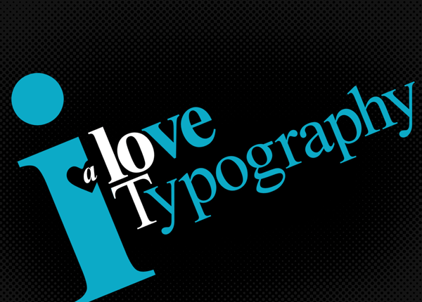 A scaled down and cropped version of the I Love Typography A Lot image from I Love Typography.
The idea was to reproduce the image from simple markup, and to rely as much as possible on what can be achieved with CSS.
This is the HTML I ended up using.
<p>I love <strong>typography</strong> <em>a lot</em></p>
This is the CSS that controls the presentation of that content.
body {
padding: 0;
margin: 0;
font-family: Times New Roman, serif;
background: #000;
}
p {
position: relative;
width: 1100px;
padding: 100px 0 0;
margin: 0 auto;
font-size: 175px;
font-weight: bold;
line-height: 1.2;
letter-spacing: -13px;
color: #0caac7;
transform: rotate(-20deg);
}
p:first-letter {
float: left;
margin: -137px -20px 0 0;
font-size: 880px;
line-height: 595px;
text-transform: lowercase;
}
p:first-line {
font-size: 200px;
}
p strong {
display: block;
margin: -80px 0 0;
font-weight: normal;
letter-spacing: -2px;
text-transform: capitalize;
}
p strong:first-letter {
margin-right: -30px;
color: #fff;
}
p em {
position: absolute;
z-index: 10;
top: 100px;
left: 147px;
width: 136px;
overflow: hidden;
padding-left: 64px;
font-size: 200px;
font-style: normal;
text-transform: lowercase;
color: #fff;
}
p em:first-letter {
float: left;
margin: 130px 0 0 -55px;
font-size: 80px;
font-style: italic;
line-height: 20px;
color: #fff;
}
p:before,
p:after {
content: "";
position: absolute;
z-index: 1;
top: 225px;
left: 120px;
width: 75px;
height: 50px;
background: #000;
transform: rotate(45deg);
border-radius: 25px 0 0 30px;
}
p:after {
left: 138px;
transform: rotate(-45deg);
border-radius: 0 25px 30px 0;
}
p strong:before {
content: "";
position: absolute;
z-index: 11;
top: 205px;
left: 341px;
width: 7px;
height: 7px;
background: #000;
border-radius: 7px;
}
The final CSS typography experiment approximates the original image in all modern browsers that support the CSS3 properties of border-radius and transform.
Some browsers render type (especially after rotational transformations) better than others. Note that all the screenshots are taken from browsers running on Windows Vista OS.
 **Opera 10.5**. The closest approximation to the original source image.
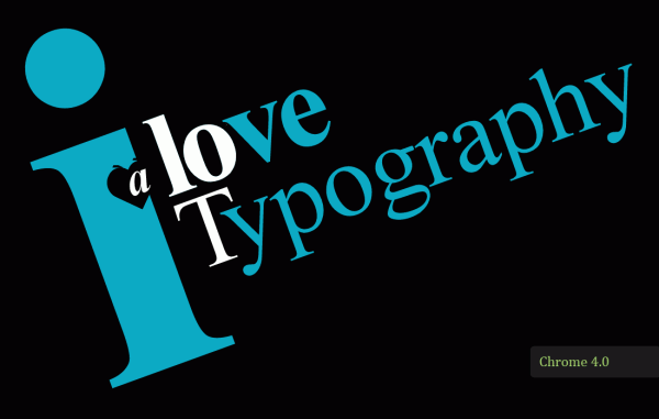 **Chrome 4.0**. Identical to Opera 10.5 apart from a bug that appears in the rendering of rounded corners when they undergo a rotational transformation.
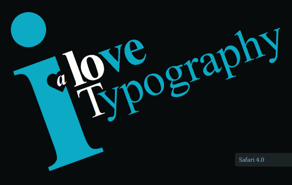 **Safari 4.0**. The rotated type suffers from a lack of anti-aliasing.
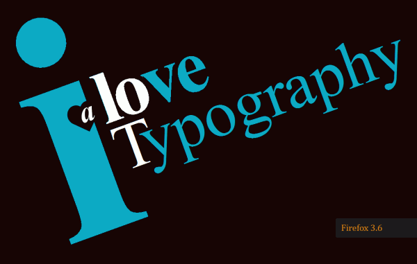 **Firefox 3.6**. The rotated type suffers from a lack of anti-aliasing.
I’ve put together a small test page to highlight some new CSS 2.1 and CSS3 bugs in modern browsers. It includes two new CSS 2.1 bugs in Internet Explorer 8.