I recently included the option to add a large cover image, like the one above, to my posts. The source image is cropped, and below specific maximum dimensions it’s displayed at a predetermined aspect ratio. This post describes the implementation.
Known support: Chrome, Firefox, Safari, Opera, IE 9+
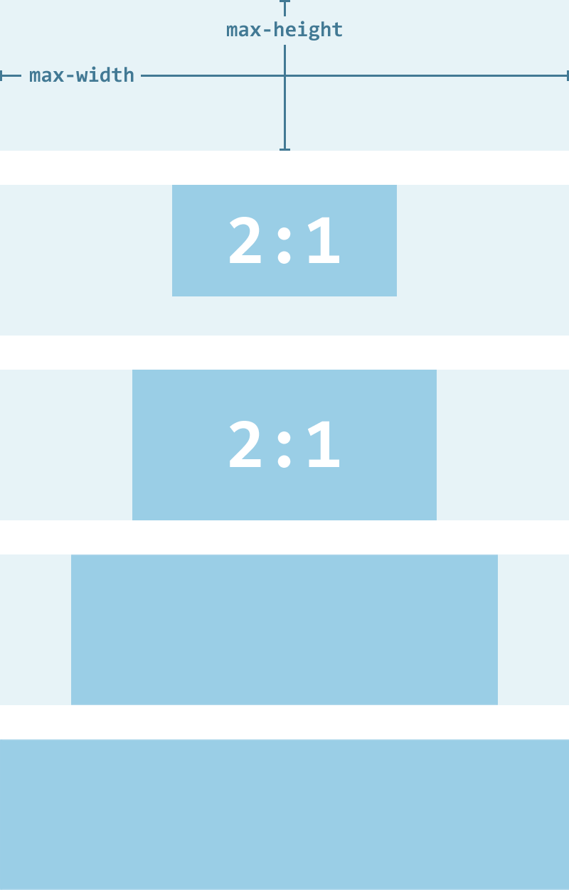
The way that the cover image scales, and changes aspect ratio, is illustrated in the following diagram.
The cover image component must:
- render at a fixed aspect ratio, unless specific maximum dimensions are exceeded;
- support different aspect ratios;
- support
max-height and max-width; - support different background images;
- display the image to either fill, or be contained within the component;
- center the image.
The aspect ratio of an empty, block-level element can be controlled by setting a percentage value for its padding-bottom or padding-top. Given a declaration of padding-bottom:50% (and no explicit height), the rendered height of the element will be 50% of its width.
.CoverImage {
  padding-bottom: 50%;
}
Changing that padding value will change the aspect ratio. For example, padding of 25% results in an aspect ratio of 4:1, padding of 33.333% results in an aspect ratio of 3:1, etc.
The problem with using this aspect ratio hack is that if the element has a max-height declared, it will not be respected. To get around this, the hack can be applied to a pseudo-element instead.
.CoverImage:before {
  content: "";
  display: block;
  padding-bottom: 50%;
}
Now the main element can take a max-height. It should also clip the pseudo-element overflow.
.CoverImage {
  display: block;
  max-height: 300px;
  max-width: 1000px;
  overflow: hidden;
}

.CoverImage:before {
  content: "";
  display: block;
  padding-bottom: 50%;
}
This aspect ratio pattern is provided by the FlexEmbed component for SUITCSS. That component is primarily for responsive video embeds, but it’s flexible enough to be useful whenever you need an element rendered at a predetermined aspect ratio. It comes with modifiers for 2:1, 3:1, 16:9, and 4:3 aspect ratios. The cover image component can extend the FlexEmbed component.
<div class="CoverImage FlexEmbed FlexEmbed--2by1"></div>
The cover image is applied as a background image that is sized to cover the entire area of the element. This makes sure the image is clipped to fit the aspect ratio of the element.
.CoverImage {
  ...
  background-repeat: no-repeat;
  background-size: cover;
}
If you want different cover images for different instances of the component, they can be applied via the style attribute.
<div class="..." style="background-image: url(cover.jpg)"></div>
The image can be fully centered by using background positioning and block centering. This makes sure that the image is centered in the element, and that the element is centered within its parent (when it reaches the max-width value).
.CoverImage {
  ...
  background-position: 50%;
  background-repeat: no-repeat;
  background-size: cover;
  margin: 0 auto;
}
If you depend on the FlexEmbed module, the amount of additional code required is minimal. (See the demo for all the code, including the FlexEmbed dependency.)
.CoverImage {
background-position: 50%;
background-repeat: no-repeat;
background-size: cover;
margin: 0 auto;
max-height: 300px;
max-width: 1000px;
}
<div class="CoverImage FlexEmbed FlexEmbed--3by1"
     style="background-image:url(cover.jpg)">
</div>
You can add further customizations, such as setting the accompanying background color, or providing a means to switch between the cover and contain keywords for background-size.