Multiple Backgrounds and Borders with CSS 2.1

Using CSS 2.1 pseudo-elements to provide up to 3 background canvases, 2 fixed-size presentational images, and multiple complex borders for a single HTML element. This method of progressive enhancement works for all browsers that support CSS 2.1 pseudo-elements and their positioning. No CSS3 support required.

Support: Firefox 3.5+, Safari 4+, Chrome 4+, Opera 10+, IE8+.

How does it work?

Essentially, you create pseudo-elements using CSS (:before and :after) and treat them similarly to how you would treat HTML elements nested within your target element. But they have distinct benefits — beyond semantics — over the use of nested HTML elements.

To provide multiple backgrounds and/or borders, the pseudo-elements are pushed behind the content layer and pinned to the desired points of the HTML element using absolute positioning.

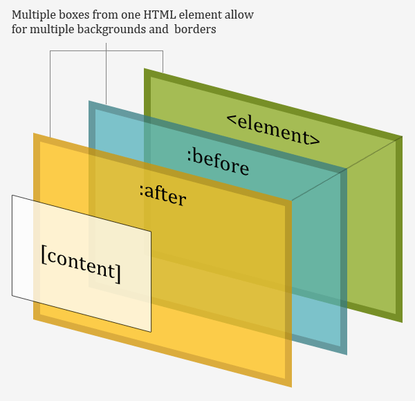
The pseudo-elements contain no true content and are absolutely positioned. This means that they can be stretched to sit over any area of the “parent” element without affecting its content. This can be done using any combination of values for the top, right, bottom, left, width, and height properties and is the key to their flexibility.

What effects can be achieved?

Using just one element you can create parallax effects, multiple background colours, multiple background images, clipped background images, image replacement, expandable boxes using images for borders, fluid faux columns, images existing outside the box, the appearance of multiple borders, and other popular effects that usually require images and/or the use of presentational HTML. It is also possible to include 2 extra presentational images as generated content.

The Multiple Backgrounds with CSS 2.1 and Multiple Borders with CSS 2.1 demo pages show how several popular examples of these effects can be achieved with this technique.

Most structural elements will contain child elements. Therefore, more often than not, you will be able to gain a further 2 pseudo-elements to use in the presentation by generating them from the first child (and even last-child) element of the parent element. In addition, you can use style changes on :hover to produce complex interaction effects.

Example code: multiple background images

Using this technique it is possible to reproduce multiple-background parallax effects like those found on the Silverback site using just one HTML element.

The element gets its own background image and any desired padding. By relatively positioning the element it acts as the reference point when absolutely positioning the pseudo-elements. The positive z-index will allow for the correct z-axis positioning of the pseudo-elements.

#silverback {
   position:relative;
   z-index:1;
   min-width:200px;
   min-height:200px;
   padding:120px 200px 50px;
   background:#d3ff99 url(vines-back.png) -10% 0 repeat-x;
}

Both pseudo-elements are absolutely positioned and pinned to each side of the element. The z-index value of -1 moves the pseudo-elements behind the content layer. This way the pseudo-elements sit on top of the element’s background and border but all the content is still selectable or clickable.

#silverback:before,
#silverback:after {
   position:absolute;
   z-index:-1;
   top:0;
   left:0;
   right:0;
   bottom:0;
   padding-top:100px;
}

Each pseudo-element then has a repeated background-image set. This is all that is needed to reproduce the parallax effect.

The content property lets you add an image as generated content. With two pseudo-elements you can add 2 further images to an element. They can be crudely positioned within the pseudo-element box by varying other properties such as text-align and padding.

#silverback:before {
   content:url(gorilla-1.png);
   padding-left:3%;
   text-align:left;
   background:transparent url(vines-mid.png) 300% 0 repeat-x;
}

#silverback:after {
   content:url(gorilla-2.png);
   padding-right:3%;
   text-align:right;
   background:transparent url(vines-front.png) 70% 0 repeat-x;
}

The finished product is part of the Multiple Backgrounds with CSS 2.1 demo.

Example code: fluid faux columns

Another application is creating equal height fluid columns without images or extra nested containers.

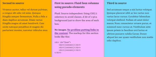
The HTML base is very simple. I’ve used specific classes on each child div rather than relying on CSS 2.1 selectors that IE6 does not support. If you don’t require IE6 support you don’t actually need the classes.

<div id="faux">
   <div class="main">[content]</div>
   <div class="supp1">[content]</div>
   <div class="supp2">[content]</div>
</div>

The percentage-width container is once again relatively positioned and a positive z-index is set. Applying overflow:hidden gets the element to wrap its floated children and will hide the overflowing pseudo-elements. The background colour will provide the colour for one of the columns.

#faux {
   position:relative;
   z-index:1;
   width:80%;
   margin:0 auto;
   overflow:hidden;
   background:#ffaf00;
}

By using relative positioning on the child div‘s you can also control the order of the columns independently of their source order.

#faux div {
   position:relative;
   float:left;
   width:30%;
}

#faux .main {left:35%}
#faux .supp1 {left:-28.5%}
#faux .supp2 {left:8.5%}

The other two full-height columns are produced by creating, sizing, and positioning pseudo-elements with backgrounds. These backgrounds can be (repeating) images if the design requires.

#faux:before,
#faux:after {
   content:"";
   position:absolute;
   z-index:-1;
   top:0;
   right:0;
   bottom:0;
   left:33.333%;
   background:#f9b6ff;
}

#faux:after {
   left:66.667%;
   background:#79daff;
}

The finished product is part of the Multiple Backgrounds with CSS 2.1 demo.

Example code: multiple borders

Multiple borders are produced in much the same way. Using them can avoid the need for images to produce simple effects.

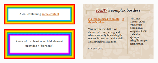
An element must be relatively positioned and have sufficient padding to contain the width of the extra border you will be creating with pseudo-elements.

#borders {
   position:relative;
   z-index:1;
   padding:30px;
   border:5px solid #f00;
   background:#ff9600;
}

The pseudo-elements are positioned at specific distances away from the edge of the element’s box, moved behind the content layer with the negative z-index, and given the border and background values you want.

#borders:before {
   content:"";
   position:absolute;
   z-index:-1;
   top:5px;
   left:5px;
   right:5px;
   bottom:5px;
   border:5px solid #ffea00;
   background:#4aa929;
}

#borders:after {
   content:"";
   position:absolute;
   z-index:-1;
   top:15px;
   left:15px;
   right:15px;
   bottom:15px;
   border:5px solid #00b4ff;
   background:#fff;
}

That’s all there is to it. The finished product is part of the Multiple Borders with CSS 2.1 demo.

Progressive enhancement and legacy browsers

IE6 and IE7 have no support for CSS 2.1 pseudo-elements and will ignore all :before and :after declarations. They get none of the enhancements but are left with the basic usable experience.

A warning about Firefox 3.0

Firefox 3.0 supports CSS 2.1 pseudo-elements but does not support their positioning. Due to this partial support, you should avoid declaringdisplay:block for absolutely positioned pseudo-elements that explicitly declare a width or height values. However, when using borders there is no graceful fallback for Firefox 3.0. Although, sometimes an improved appearance in Firefox 3.0 can be achieved by adding display:block to pseudo-element hacks that use borders.

Enhancing with CSS3

All the applications included in this article could be further enhanced to take advantage of present-day CSS3 implementations.

Using border-radius, rgba, and transforms, and CSS3 multiple background images in tandem with pseudo-elements can produce even more complex presentations that I hope to include in a future article. Currently there is no browser support for the use of CSS3 transitions or animations on pseudo-elements.

In the future: CSS3 pseudo-elements

The proposed extensions to pseudo-elements in the CSS3 Generated and Replaced Content Module include the addition of nested pseudo-elements (::before::before), multiple pseudo-elements (::after(2)), wrapping pseudo-elements (::outside), and the ability to insert pseudo-elements into later parts of the document (::alternate).

These changes would provide a near limitless number, and arrangement, of pseudo-elements for all sorts of complex effects and presentations using just one element.

Let me know what you’ve done

I’ve focused on just a few applications and popular effects. If you find other applications, limitations, or want to share how you’ve applied this technique please leave a comment below or let me know on twitter (@necolas).

Translations

Reply on Twitter Retweet on Twitter Favorite on Twitter

28 comments

#

Bicrazor says…

Great use of :before and :after dude. I have been looking forward to multiple background image support, who knew we had it all along!
Keep up the good work mate, your making my life easier a little bit at a time :D

#

Chris Coyier says…

Awesome work as always. I quite like it.

It would be interesting to see the exact gap that this fills e.g. browsers that DO support both :after and :before but DO NOT support multiple-backgrounds. It’s definitely wide enough to be worth it, especially considering the most recent Firefox doesn’t support multiple-backgrounds as far as I know.

#

Nicolas says…

@Chris I believe the latest versions of Firefox, Opera, Safari, and Chrome all support multiple background images, as will IE9. But neither Firefox 3.5 nor IE8 support CSS3 multiple background images…two browsers that combined have ~35% market share at the moment.

However, multiple background images are just one application of this general idea. What you get here are multiple canvases not just multiple background images. The fluid faux columns are an example of how to use multiple background colours while still having the option to add background images and borders to each column. If you’re using fixed column widths then you can have up to 7 different column colours, 3 of which could use background images. This would be possible for fluid layouts too if border support for percentage borders was better.

So I think there is value for browsers with advanced CSS3 support. It allows for the positioning of “background” images outside of the box; easy fluid faux columns with or without images and borders; and certain types of border design without requiring images. As far as I can tell, not all those effects are possible with CSS3 yet.

Furthermore, there are a couple of visual effects (with and without images) that are only possible in browsers with certain levels of CSS3 support and would be impossible without pseudo-elements. I’ll post about them next week.

That’s already quite a few applications that allow you to write semantic HTML, produce many different types of effects (using progressive enhancement) that work in all CSS 2.1 capable browsers (apart from Firefox 3), and leaves a perfectly usable experience behind for incapable browsers!

I’m sure there will be other uses that will surface as more people experiment with it.

#

Chris Coyier says…

Indeed. The idea that the faux multiple background can be more than just an image is pretty huge. And the fact that that content, image or otherwise, can be positioned outside the confines of the “parent”, just as huge.

#

Simon Foster says…

Wow, found this post really interesting, just goes to show how we haven’t realised the potential of old css before getting all excited about new css. Anyway thanks for the post, will be playing around with this :)

#

Cosmin Negoita says…

This article is very impressive and useful, indeed. I liked it very much. Thank you!

#

Chris Coyier says…

Bummer about Firefox 3.0 too. That’s the danger of browser vendors supporting new CSS properties. If they do it, but get it partly wrong, it ruins graceful degradation for a long time to come.

#

Nicolas says…

@Chris: Yeah it’s a shame about Firefox 3.0 but fortunately its marketshare is down around 3% and falling. Relatively soon it should be rare enough to be insignificant. Some effects like the faux columns actually degrade well and look just as they do in IE6 & IE7. Others not so well!

However, the level of browser support is no different to that for the pure CSS speech bubbles. If anything, these effects are more consistent across a wider range of browsers because some of the speech bubbles were significantly enhanced with CSS3. In contrast, there is no CSS3 being used in these demos other than to reproduce the rounded corners on the dribbble-esque button.

#

Russell Bishop says…

What a brilliant, creative solution to this problem. A great display of real progressive enhancement, and I’m genuinely quite excited to try this out! I’ll be sharing this around my developer colleagues to see what kind of experimentation we might come up with.

Great work Nicolas!

#

Claudio Meirana says…

Great idea! Can’t wait to try :D

#

Tim says…

The way I’m dealing with Firefox 3.0 incomplete support of :before and :after is by prefixing all the CSS rules that use it with body:first-of-type.

FF3.0 (as well as IE6, IE7, and IE8) does not support :first-of-type, so this will make sure that the rule will only apply to browsers with full support. Note that it also as the side effect of filtering out IE8 that do not support :first-of-type but does support :after/:before.

If you really need to, you can write a more specific rule to explicitly re-apply the effects for IE8, but I actually still keep IE8 filtered out, as it lacks most of the CSS fun stuff anyway.

#

Nicolas says…

@Tim: One of the main benefits of this technique is the extra options it gives in IE8. The effects such as multiple background images, cropped background images, and pseudo-columns actually degrade in Firefox 3.0 very well…leaving it looking much like IE6 and IE7.

The only time Firefox 3.0 looks “broken” is if you explicitly set both a width and height, add borders, or insert generated-content images with the pseudo-element.

Given the large (and growing) marketshare of IE8, the small (and shrinking) marketshare of Firefox 3.0, and the existing CSS3 support in other modern browsers (which allows some of these effects anyway), I’d side with serving up these styles to IE8.

#

Jon Zuck says…

Wow. Great presentation. You made me feel like an idiot! It’s so simple, so succinct, so beautiful, so *obvious* (once you showed us!). Thanks.

#

Al Stevens says…

OMG – just awesome. Well done.

#

Jordan Koschei says…

I love seeing people still pioneering new CSS techniques, a decade after 2.1 was announced. Never underestimate the ingenuity of the web design community!

#

Michał Czernow says…

Ad. “A warning about Firefox 3.0″

I managed to deal with this problem thanks to simple filtering:

:nth-child(n):before, :nth-child(n):after { content: ''; position: absolute; }

After this I can do specific styling on pseudo-elements of particular parent. Firefox 3.0 will ignore them. This filter seems to be unfriendly for performance (although I’m not worried anymore), but it’s easy to manage. In styles addressed to IE8 (via conditional comments) you can just add:

:before, :after { content: ''; position: absolute; }

I think this solutions is a bit more developer friendly (thanks to flexibility, perhaps) than Tim’s.

#

Amarnath says…

Very Nice and thank you very much for the intuitive write up as well.

#

Keri says…

Thanks for writing such a useful tutorial! Very easy to implement. =)

#

Greg says…

Looks promising for a project I’m working on! I’ll have to deploy a local copy to get a feel for the multiple borders section. Since you’re just going for audacious rainbow examples to clearly illustrate what is happening, I think it’d be super-helpful for readers if the CSS was declared in plain-language colours. border: 5px solid red, for example, instead of border: 5px solid #f00;

Smash-up, job, though. I’m looking forward to seeing what I can do with these techniques.

#

hugo torres says…

dude you rock!! this is awesome, i cant wait to put it to work.

thanks

#

Walter Ian Kaye says…

Awesome, thanks! This technique allowed me to make my text-based menubar buttons graphically “push” by using shadowed borders. One note: I had no success using negative z-indexes, but when I made them all positive I was able to get it to work.

#

Frequent says…

How about an article on how to implement :after/:before while also giving out hints on how to incorporate non-supporting browsers. I like TIM’s body:first-of-type, beats my setting of background-color: none to make pseudo elements disappear. Rgs, Frequent

#

Chris says…

Any workaround or hack for IE7? I have to write markup for this browser due to city workers still using it. I want to use the one titled “background can live outside the box”. Thanks!

#

Scott R. Godin says…

I cannot even begin to tell you how beautiful this is. you sir, are a genius. thank you from the bottom of my heart. exquisite, elegant solution to a problem I was having.

#

Chris says…

This… This post is a master piece… :)

You have no idea how long I’ve been struggling with creating tags to do layering effects. The stackoverflow.com searches, etc… And, it turns out it’s been here all along…

Thank you. Your visual representations are perfect.

Comment on this post

Please wrap code fragments in <code> tags, wrap blocks of code in <pre><code>, and use JsFiddle to post working examples.