This is a remix of another author’s idea of using CSS to make a classic model of our solar system. Here, I’ve relied on CSS pseudo-elements and generated content to render scale models of the solar system from simple markup of the raw information.
There are three demos for this experiment, which is based on Alex Giron’s original Our Solar System in CSS3.
The basic demo uses only CSS and simple, semantic HTML to relatively faithfully reproduce Alex’s original result.
The advanced demo is a rough scale model of the Solar System. It uses the same HTML as the “basic demo” but makes extensive use of CSS pseudo-elements, generated content, and various bits of CSS3.
The advanced demo (keyboard support) is an attempt to provide keyboard support by introducing slight modifications to the HTML. I’ve commented out the animations in this version of the demo.
I was curious to see if the same result could be achieved with simpler HTML, by relying on some newer CSS features.
I experimented a bit further with generated content, shadows, and the way the layout of the solar system is implemented. Doing this exposed me to some of the different ways modern browsers are implementing CSS3. I’ve described some of those differences and bugs below.
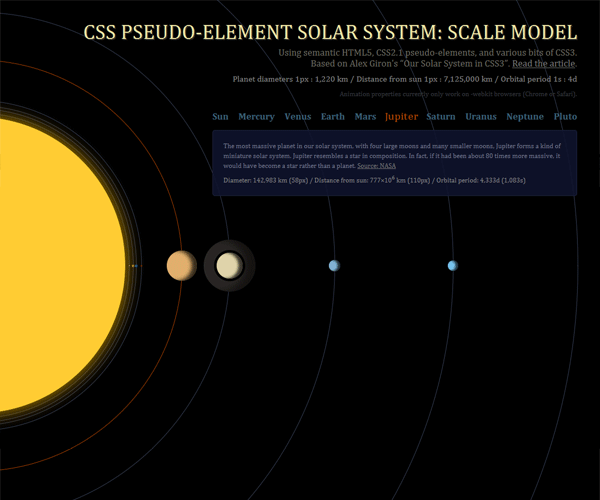
The main demo is a scale model of the solar system. It uses 3 different scales: one for the object diameters; one for the distance of the planets from the sun; and one for the orbital period of each planet.
The HTML is a list where each list item contains a title and description. I’ve included some HTML Microdata to provide hooks for generated content.
<li id="earth" itemscope>
  <h2 itemprop="object">Earth
  <dl>
    <dt>Description</dt>
    <dd itemprop="description">Earth is an ocean planet. Our home world's abundance of water - and life - makes it unique in our solar system. Other planets, plus a few moons, have ice, atmospheres, seasons and even weather, but only on Earth does the whole complicated mix come together in a way that encourages life - and lots of it.</dd>
    <dt>Diameter</dt>
    <dd itemprop="diameter">12,755 <abbr title="kilometers">km</abbr></dd>
    <dt>Distance from sun</dt>
    <dd itemprop="distance">150×10<sup>6</sup> <abbr title="kilometers">km</abbr></dd>
    <dt>Orbital period</dt>
    <dd itemprop="orbit">365<abbr title="days">d</abbr></dd>
  </dl>
</li>
Pseudo-elements are used to produce the planets, Saturn’s ring, the planet names, and to add the scale information.
Given that the scales only make sense when CSS is loaded it isn’t appropriate to have the scales described in the HTML. Both demos use the same HTML but only one of them is a rough scale model. Therefore, in the scale model demo I’ve used generated content to present the ratios and append extra information to the headings.
header h1:after {content:": A scale model";}
header h2:after {content:"Planet diameters 1px : 1,220 km / Distance from sun 1px : 7,125,000 km / Orbital period 1s : 4d";}

#earth dd[itemprop=diameter]:after {content:" (5px) / ";}
#earth dd[itemprop=distance]:after {content:" (22px) / ";}
#earth dd[itemprop=orbit]:after {content:" (91s)";}
Even more complex 3D presentations are likely to be possible using webkit-perspective and other 3D transforms.
With a little modification it is possible to provide some form of keyboard support so that the additional information and highlighting can be viewed without using a mouse. Doing so requires adding block-level anchors (allowed in HTML5) and modifying some of the CSS selectors.
This experiment only works adequately in modern browsers such as Safari 4+, Chrome 4+, Firefox 3.6+ and Opera 10.5+.
Even among the current crop of modern browsers, there are bugs and varying levels of support for different CSS properties and values. In particular, webkit’s box-shadow implementation has issues.
There are a few other unusual :hover bugs in Opera 10.5 (most obvious in the basic demo). It should also be noted that the :hover area remains square in all modern browsers even when you apply a border-radius to the element.
There are also a few other peculiarities around percentage units for border radius. Of the modern browsers, a square object with a border-radius of 50% will only produce a circle in Safari 5, Chrome 5, and Firefox 3.6.
Safari 4 doesn’t appear to support percentage units for border radius at all (which is why the CSS in the demos explicitly sets a -webkit-border-radius value for each object). Safari 5 and Chrome 5 do support percentage units for this property. However, Chrome 5 has difficulty rendering a 1px wide border on a large circle. Most of the border simply isn’t rendered.
In Opera 10.5, if you set border-radius to 50% you don’t always get a circle, so I have had to redeclare the border-radius for each object in pixel units.
 Opera 10.5's incorrect rendering of `border-radius:50%`
It appears that this is one aspect of Opera’s non-prefixed border-radius implementation that is incorrect and in need of fixing.
Safari 4’s inferior box-shadow implementation means that inset shadows are not rendered on the planet bodies. In addition, the second box-shadow applied to Saturn (used to separate the planet from its ring) is completely missing in Safari 4 as it does not support a spread radius value.
Safari 5 and Chrome 5 are better but still problematic. The second box-shadow is not perfectly round as the box-shadow seems to use the pseudo-element’s computed border-radius. Furthermore, Chrome 5 on Windows does not properly support inset box-shadow meaning that the shadow ignores the border-radius declaration and appears as a protruding square.
 Safari 5 and Chrome 5 make different mistakes in their rendering of this `box-shadow`
The use of box-shadow to separate Saturn from the ring isn’t strictly necessary. You can create the separated ring using a border but box-shadow cannot be applied in a way that casts it over a border. Another alternative would be to add a black border around the planet to give the illusion of space between itself and the ring, but all browsers display a few pixels of unwanted background colour all along the outer edge of the rounded border.
I wanted the ring to share the appearance of a shadow being cast on it. Opera 10.5 and Firefox 3.6 get it right. Both webkit browsers get it wrong.